

Medium Shift
Color is catching.

From the supercali-sprezzatura-expialidocious files. And people, this one is going to have to be read in the app or on your desktop!!!
“..debate over whether colors really, physically exist or are only internal manifestations has raged since the seventeenth century.”
― Kassia St. Clair, The Secret Lives of Color
With Rothko in Florence making the visual rounds, Frieze New York in the rearview, and forecasters featuring the darlings that are on a second or third round in the trend cycles— I am talking to you butter yellow and chartreuse— the cruise affairs from JW + Blazy and Demna’s goose chase, inspired boldness on the catwalk. And I’m sure flea market hunters left Brimfield brimming with color. To give them (the colors) the benefit of the doubt no season opener is complete without some citrus to ease us in to sunnier (and sweatier) days. Flags will rub shoulders in the Peach state with the world cup descending on the city in a forest. Leonine pairings and their architecture are set to steal the show. By trend or by chance, I am also draping my limbs in as much color as possible.
Spring dusts off the greige haze, summer fast approaches, and in historically paradoxical fashion, when the world is ablaze the culture looks towards positive reinforcements. These are colors with which my eye has been consulting while monitoring the runways, stepping into nature or surveying the patrons that walk into the antique shop on a Sunday afternoon.
Primary was all the rage at the onset of the year and now the scales are leaning into ROYGBIV’s bejeweled and dusted constituents. I’m not claiming that everyone should only wear color when it’s trending or prophesize on colors are in flux every season season. I am just absorbing the current pigment abundance.
Refractive and reflective.
Not to mention, all of these colors pair well with some espresso, the plucked- from-the-earth neutral that continues to caffeinate any ensemble.
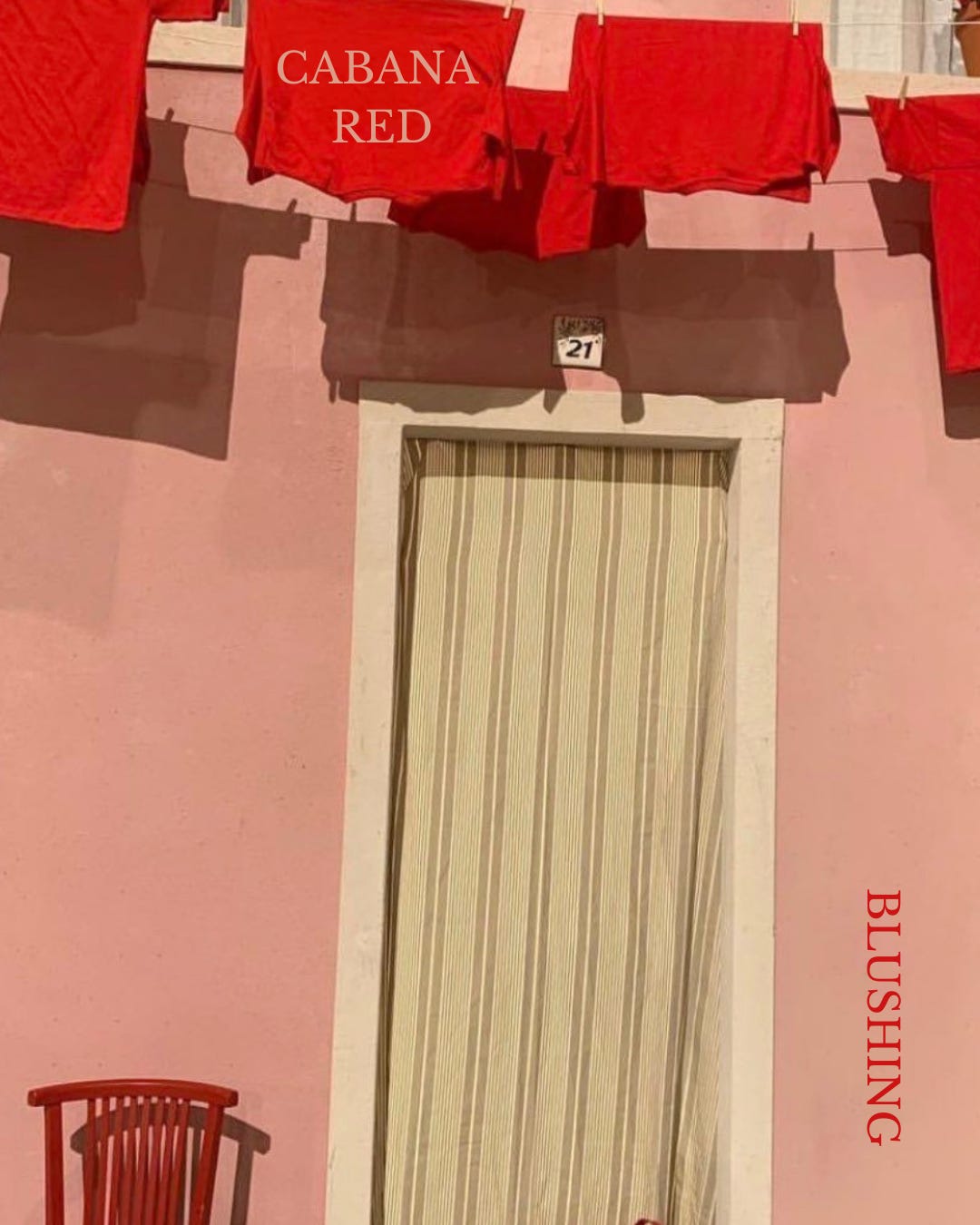
CABANA RED
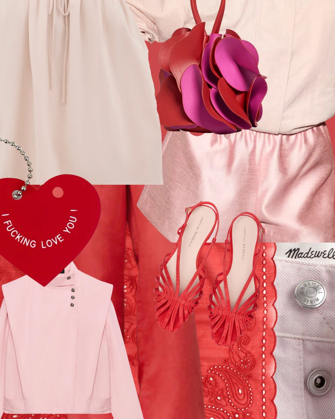
This traditionally romantic combo makes for sweet treat filled days in the sun, or under a cabana. Red and pink together used to be a fashion crime. Now they're showing up everywhere—from resort wear to bridal palettes. Summer is having a romantic resurgence.
Heart it here first.
BLUSH
YELLOW(S)
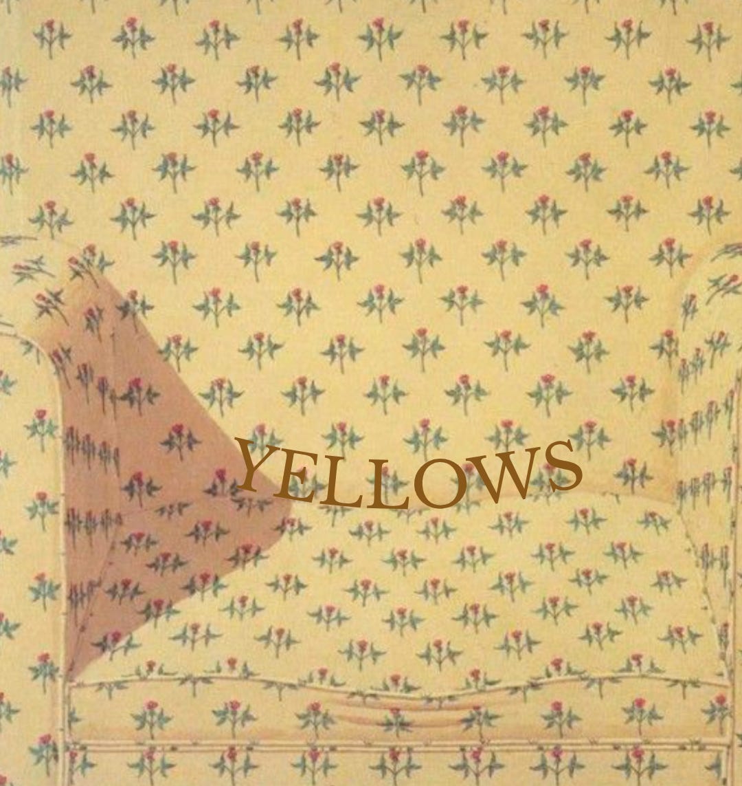
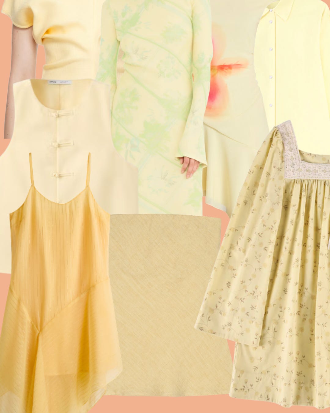
Plural! Soft yellow is marigold’s gentler sister—less concentrated, more diffused. Morning light instead of golden hour. It plays beautifully with gingham, vintage florals, and stripes. I’ve painted three rooms this shade. It never fights back. Marigold is concentrated golden hour in a bottle. It’s the color of late of summer stretching long like a cat. Forecasters say it’s replacing millennial yellow—less pastel, more saturated, more alive. If that’s something you are looking for.
BURNT ORANGE
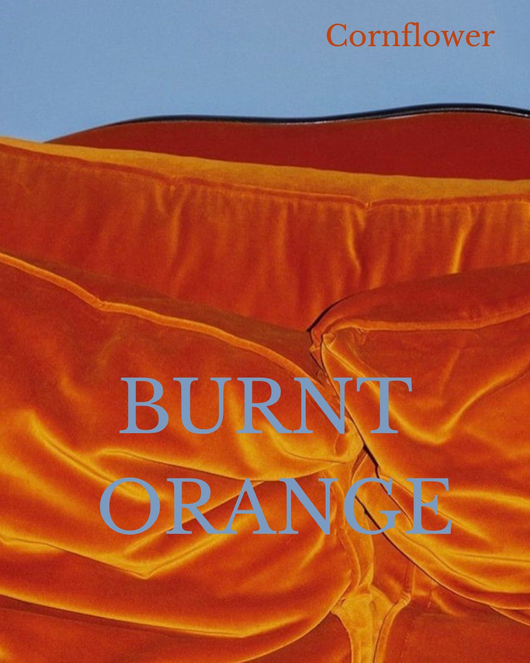
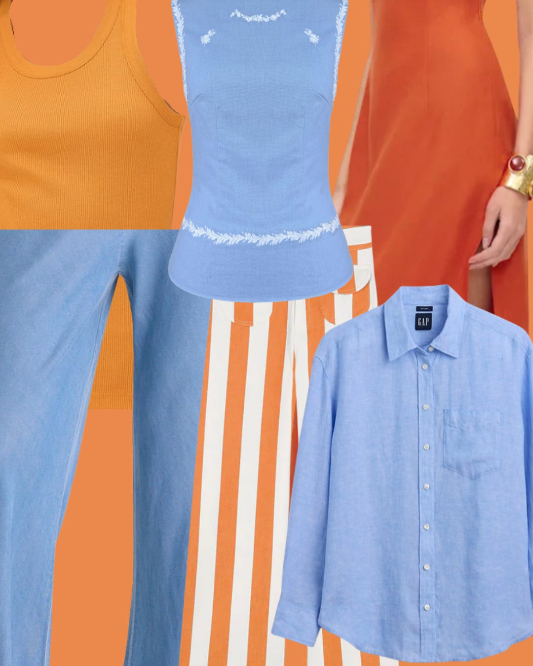
Burnt orange has been building momentum. Not neon, not rust, but somewhere in between. The color of terracotta, sunset, things that have been warmed by fire. It tests boundaries (who wears head-to-toe orange?) but when paired with a cornflower counterpart, it softens. Blue grounds orange. Orange warms blue. Together, they’re blue skies and Georgia clay, Sedona, and New England summering in a bottle.
CLOUD COVERAGE
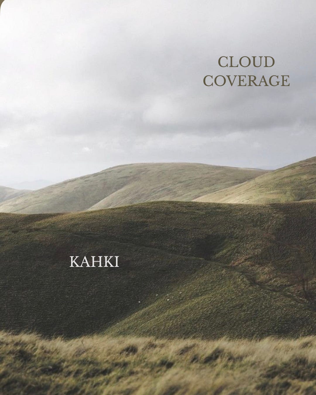
Cloud coverage offers relief from the saturation. After marigold and cobalt and plum, the eye needs somewhere to rest. Soft gray-whites, the color of overcast skies and linen sheets and mornings that stretch slow. It’s the neutral that doesn’t disappear but expands our options beyond champagne beige, black and white.
Imagine with the red slings + a perfectwhitetee
KHAKI
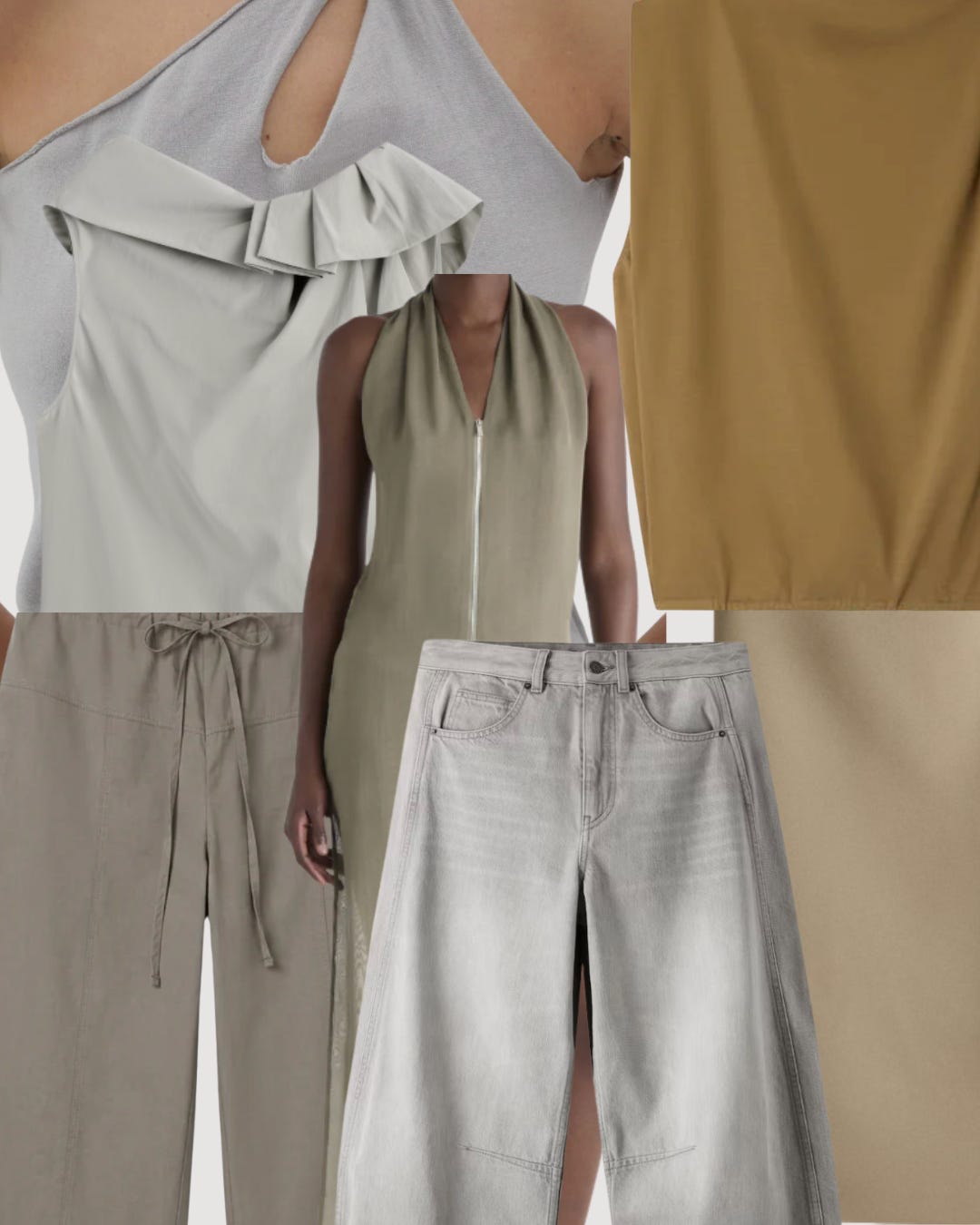
Khaki has tactile staying power. It’s been around since the British Empire needed camouflage, and it refuses to leave. Golden-tan, slightly olive, the color of dried grass and desert landscapes. It pairs with everything—burnt orange, teal, plum, cloud coverage. The workhorse neutral that never quits.
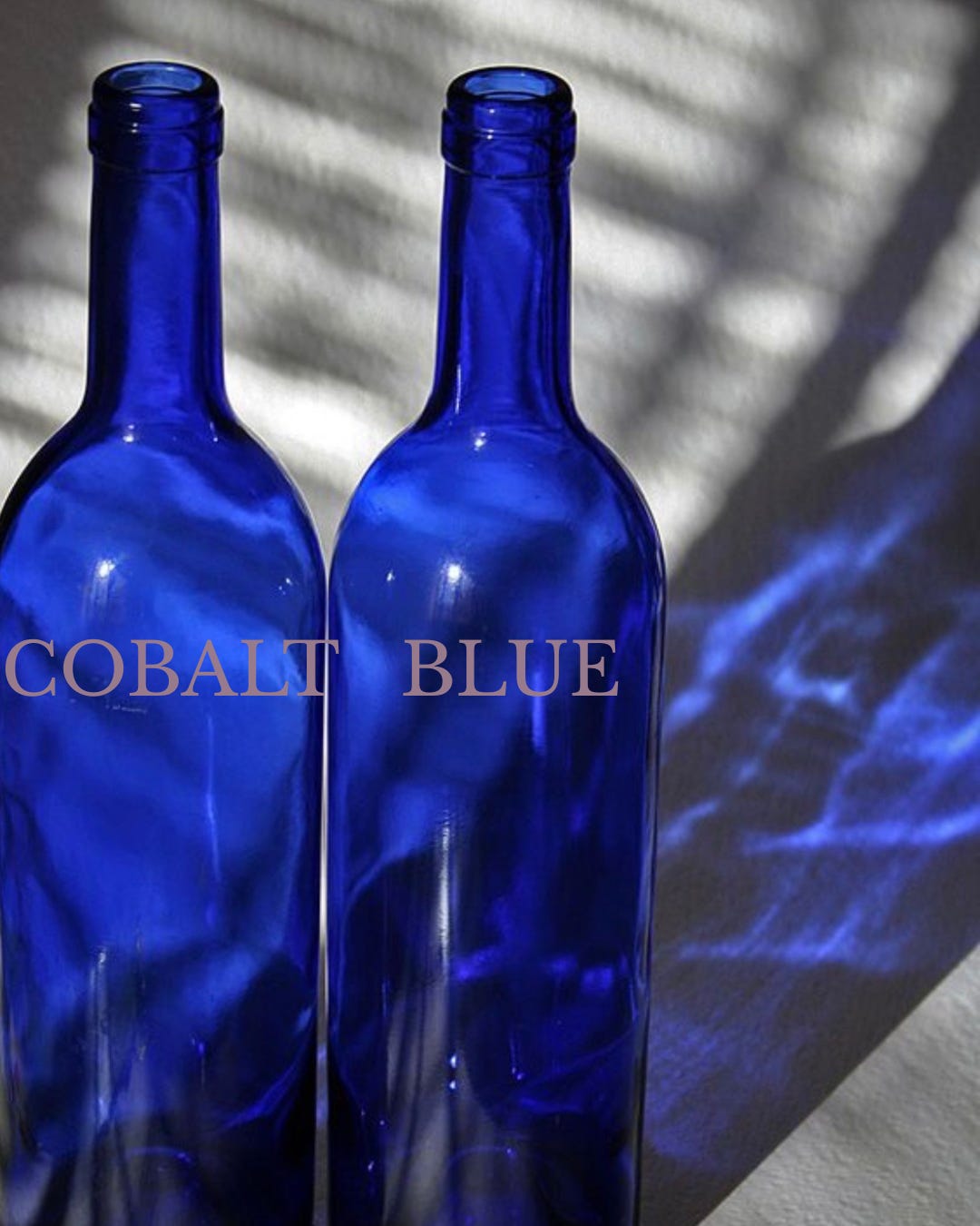
COBALT BLUE
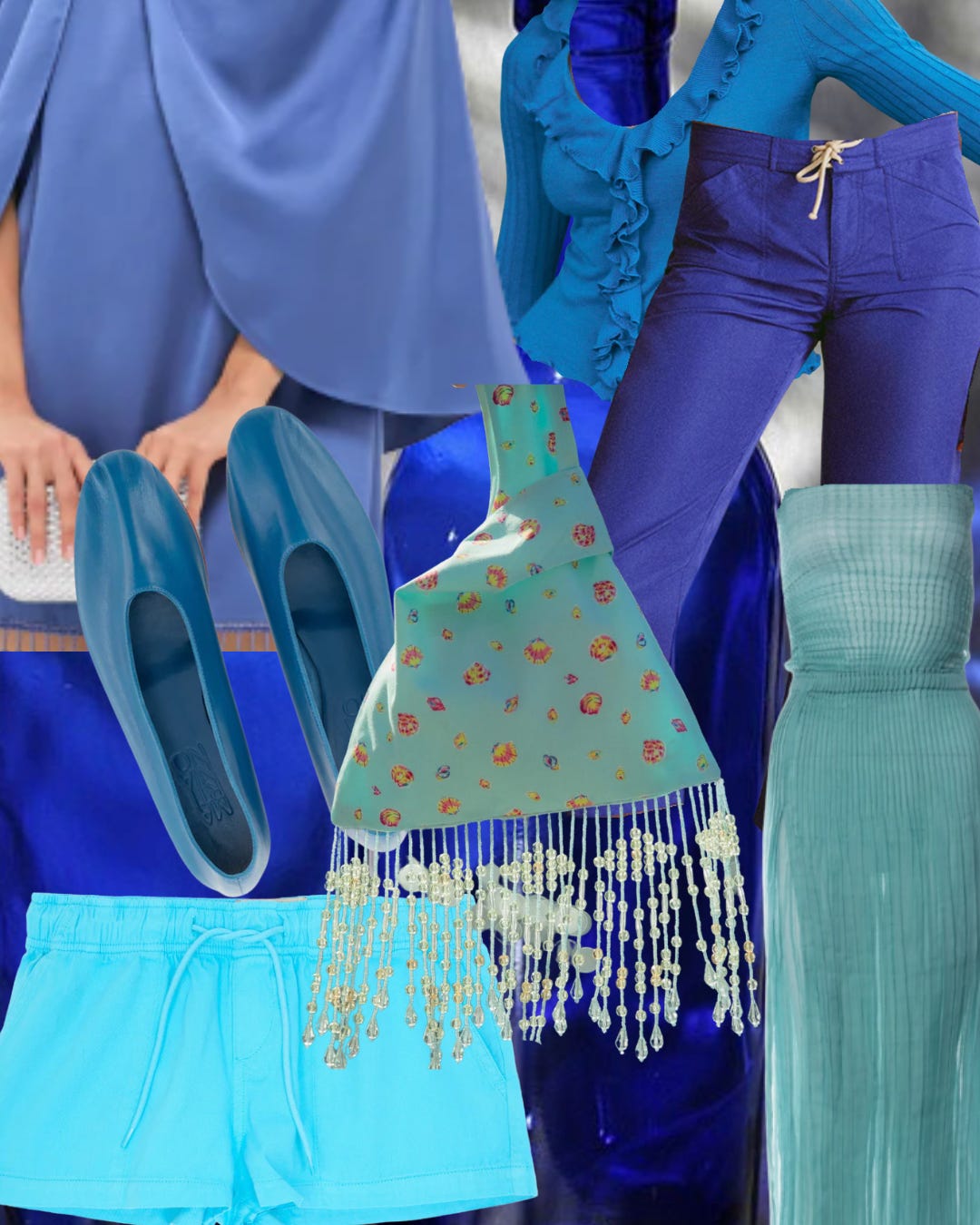
This hue demands commitment. You can't wear it halfway. For years, we relegated bright blue to accents. According to the “Secret Lives of Colors,” it symbolized barbarism and degeneracy. Now it's a conquering of the ENTIRE outfit. Bold without being loud, saturated without being aggressive. I often reach for a cobalt vase in my hourse and restructure my entire floral story around it.
PLUM
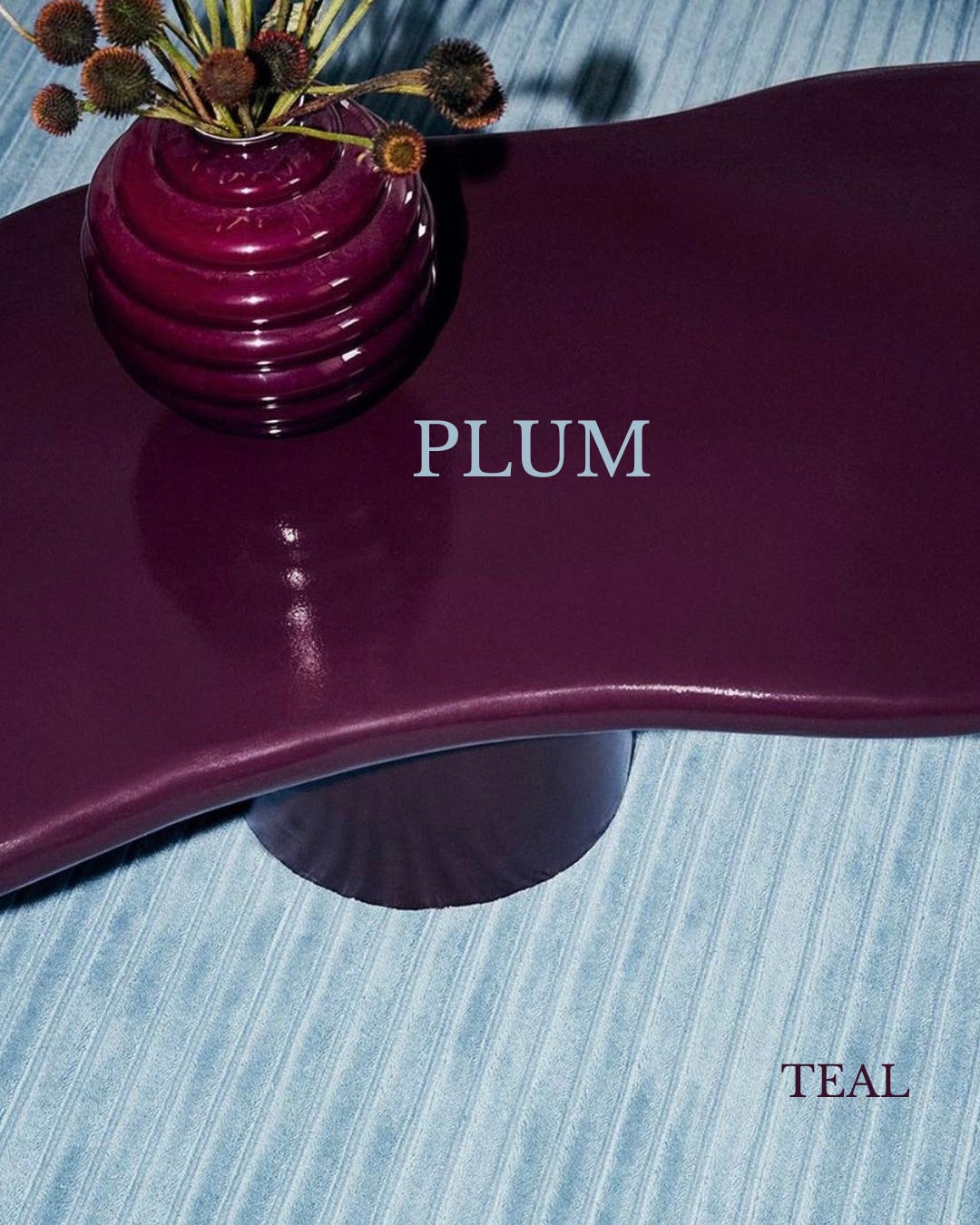
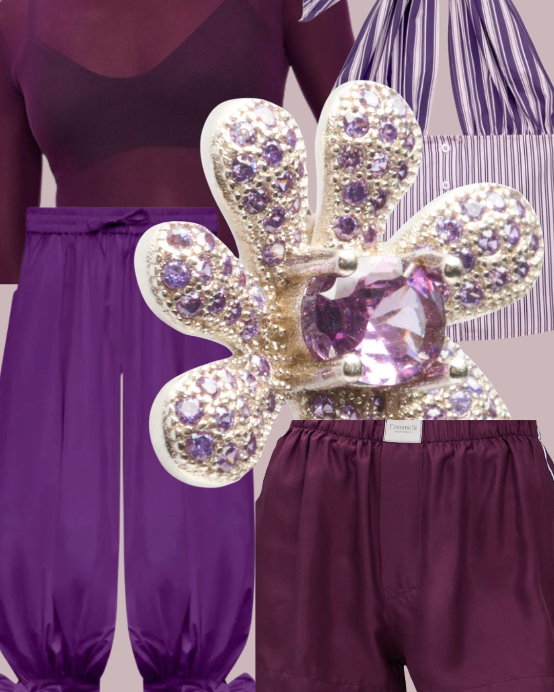
My favorite summer fruit is a plum, especially if they are wild, so it begs the question of why can’t we include it in the burgeoning purple profile that isn’t taking no for an answer. And teal? Well from turquoise accents found in the wild west to the MET steps, this color speaks to our summer dreams.
TEAL
ORCHARD
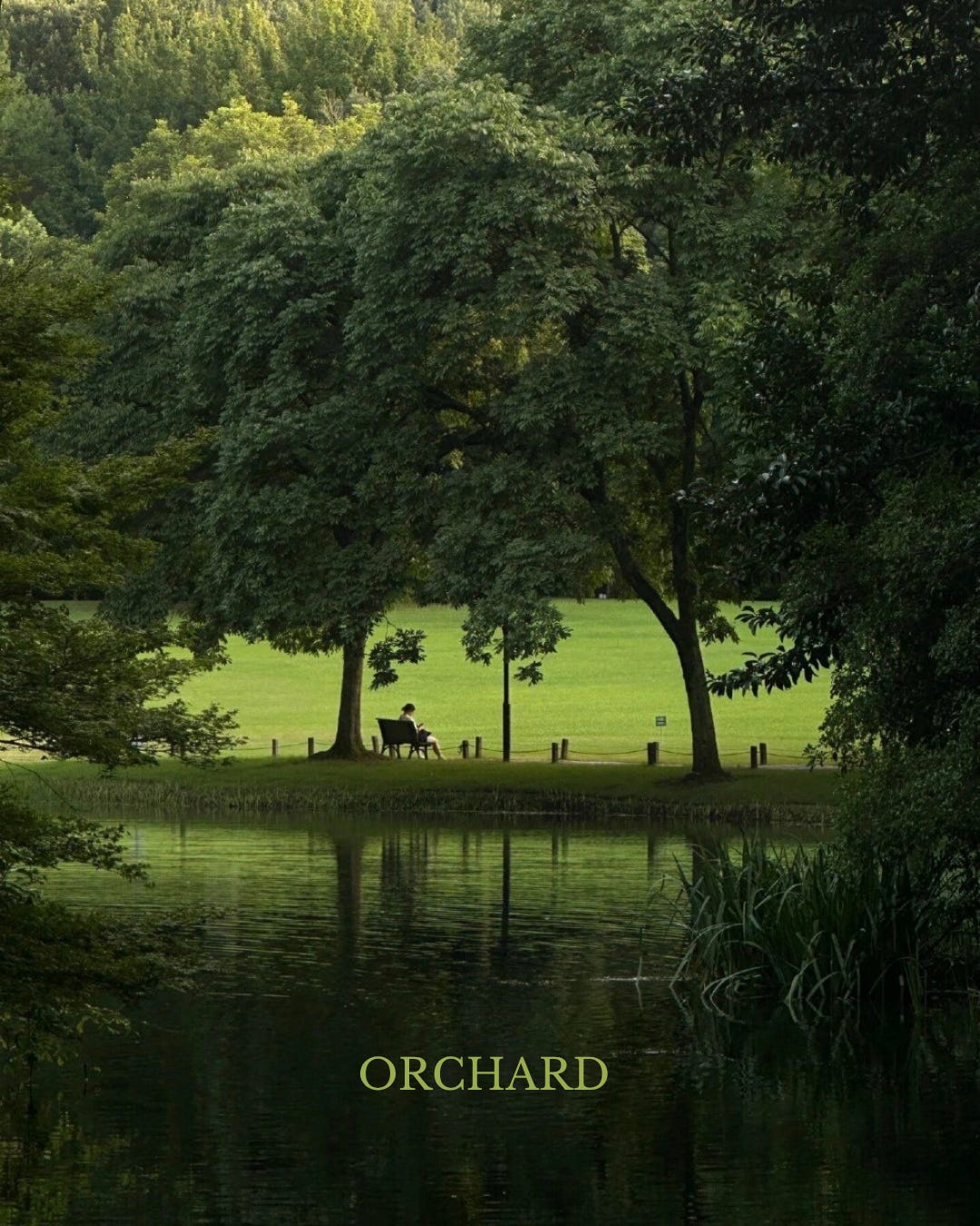
Zara prompted me to dive into Orchard green. From the weeds to the fungi, the notion envelops you in nature, beautifully orchestrated in small details and entire ensembles that elicit the gradients of an orchard. Not sage, not olive. Actual chlorophyll. The color of standing under trees in June while the horses stood by on a lead line. It lowers cortisol and raises joy in equal measure.
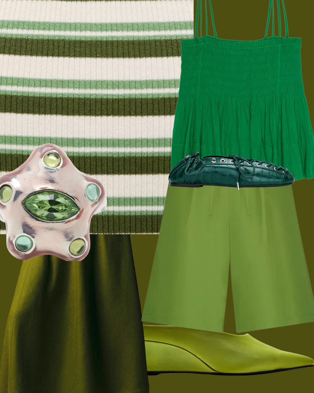
Dipping my toes in a couple of ideas, here is a larger glimpse into what I am seeing and simultaneously confirming as I scan written and worn articles, a material upload if you will. Perhaps in an idealized world I have the means to edit my closet with these drool-worthy splashes of color. It is also an evergreen reminder that dressing up > drinking up. Aurafarming, confirmed (more on that to come!)
Dancing cloud has unburdened us, to uncover terrain to which this new color map will inextricably link our memories.
WARMLY,
A Sober Aesthete Trend Forecasting for a Soul that Says Go Bold or Go Home.
If you want suit up spiritually check out my planetary post:
Materially
Or both…
I hope you enjoy! Comeback next week, the forecast is looking up!